Boston Public Library Website
Client:
Boston Public Library
Industry:
Public Sector / Civic, Education
Team:
Dani Vykadel, Maddie Gaudet, Alex Maxim (UX Design & Research)
Deliverables:
Web Design, UX Design, UX Research
Context:
2022-2023

First Steps
Partnering with the Boston Public Library Special Collections team, we redesigned the experience navigating multiple archival discovery platforms. The goal was to help patrons spend less time figuring out where to search and more time accessing the materials they needed, while reducing the amount of guidance required from library staff.
Problem Statement
The current Special Collections experience is fragmented across several search platforms leaving users unsure which tools to use, how to request materials, or find the Special Collections. This create friction for first-time patrons and experiences researches, while increasing the support needed from library staff.
Solution
A clearer information architecture centered around intuitive navigation, simplified discovery tools, improved content hierarchy, representative imagery, and streamlined workflows for requesting materials. The redesign focused on making the Special Collections understandable before users begin searching while maintaining consistency to BPLs overall brand.
First Steps
Partnering with the Boston Public Library Special Collections team, we redesigned the experience navigating multiple archival discovery platforms. The goal was to help patrons spend less time figuring out where to search and more time accessing the materials they needed, while reducing the amount of guidance required from library staff.
Problem Statement
The current Special Collections experience is fragmented across several search platforms leaving users unsure which tools to use, how to request materials, or find the Special Collections. This create friction for first-time patrons and experiences researches, while increasing the support needed from library staff.
Solution
A clearer information architecture centered around intuitive navigation, simplified discovery tools, improved content hierarchy, representative imagery, and streamlined workflows for requesting materials. The redesign focused on making the Special Collections understandable before users begin searching while maintaining consistency to BPLs overall brand.
First Steps
Partnering with the Boston Public Library Special Collections team, we redesigned the experience navigating multiple archival discovery platforms. The goal was to help patrons spend less time figuring out where to search and more time accessing the materials they needed, while reducing the amount of guidance required from library staff.
Problem Statement
The current Special Collections experience is fragmented across several search platforms leaving users unsure which tools to use, how to request materials, or find the Special Collections. This create friction for first-time patrons and experiences researches, while increasing the support needed from library staff.
Solution
A clearer information architecture centered around intuitive navigation, simplified discovery tools, improved content hierarchy, representative imagery, and streamlined workflows for requesting materials. The redesign focused on making the Special Collections understandable before users begin searching while maintaining consistency to BPLs overall brand.



Iterations
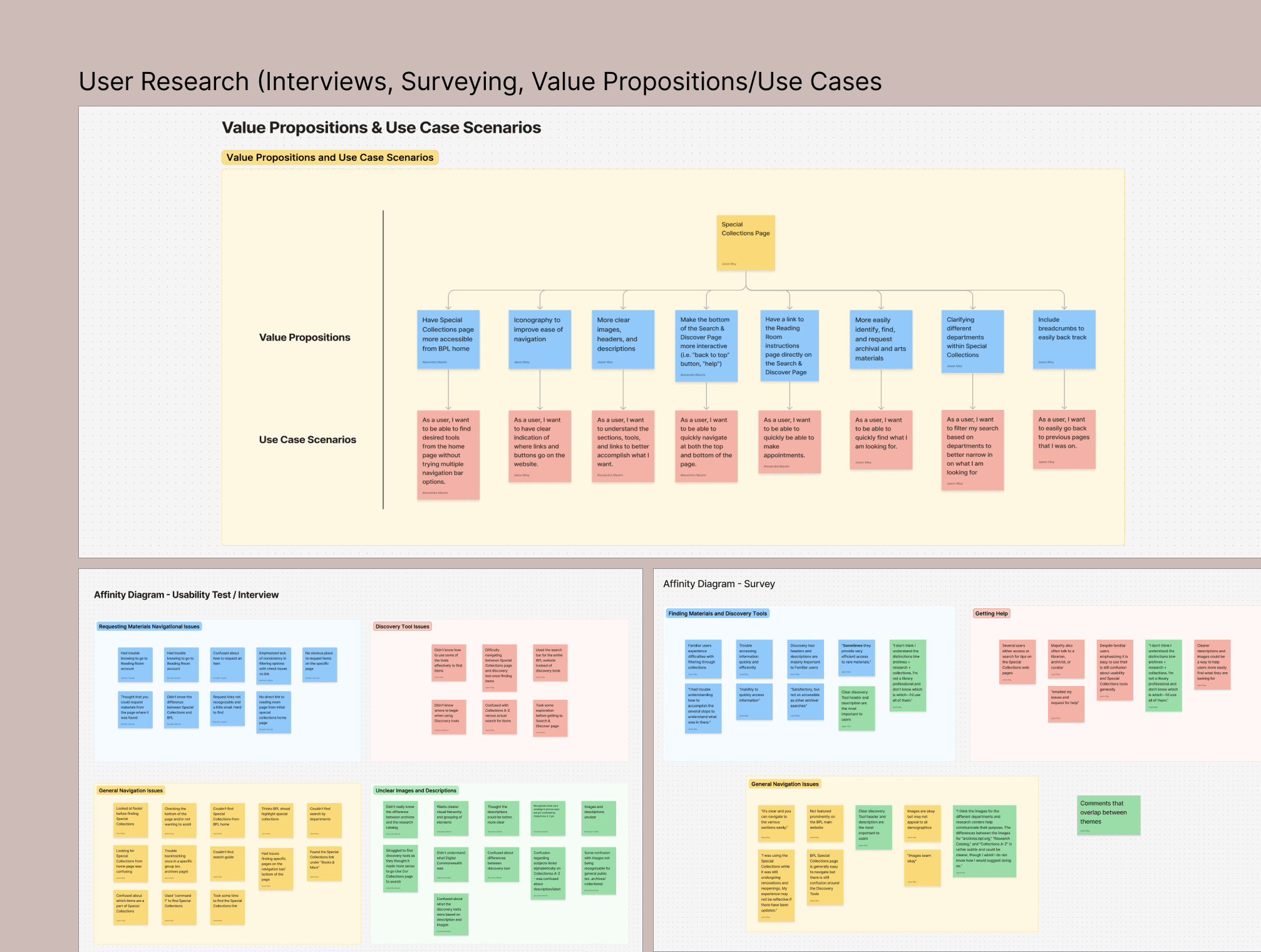
Our research and conversations with patrons and library staff uncovered several pain points:
New patrons struggled to understand the purpose of multiple discovery platforms
Patrons couldn't distinguish between search tools
Patrons frequently got lost when requesting materials or navigating back
Overall, the unclear hierarchy, large text, and lack of distinct imagery mad the experience overwhelming and difficult to scan.
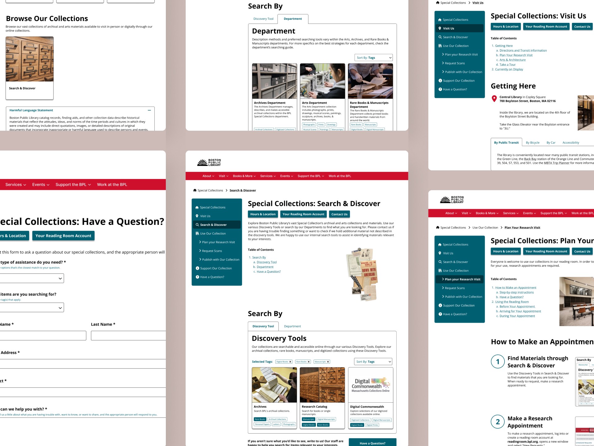
Each iteration focused on addressing these pain points. We reorganized page hierarchy, introduced filters, added breadcrumbs and other quick navigation, and redesigned workflows with annotated steps, clearer headers, and stronger visual hierarchy. The intent behind these design choices were to better explain what Special Collections is, help users identify the appropriate tools and materials, and help quickly orient the user on where they are.
We also refined the imagery, iconography, and content organization based on multiple rounds of usability testing ensuring clarity and discoverability.
Iterations
Our research and conversations with patrons and library staff uncovered several pain points:
New patrons struggled to understand the purpose of multiple discovery platforms
Patrons couldn't distinguish between search tools
Patrons frequently got lost when requesting materials or navigating back
Overall, the unclear hierarchy, large text, and lack of distinct imagery mad the experience overwhelming and difficult to scan.
Each iteration focused on addressing these pain points. We reorganized page hierarchy, introduced filters, added breadcrumbs and other quick navigation, and redesigned workflows with annotated steps, clearer headers, and stronger visual hierarchy. The intent behind these design choices were to better explain what Special Collections is, help users identify the appropriate tools and materials, and help quickly orient the user on where they are.
We also refined the imagery, iconography, and content organization based on multiple rounds of usability testing ensuring clarity and discoverability.
Iterations
Our research and conversations with patrons and library staff uncovered several pain points:
New patrons struggled to understand the purpose of multiple discovery platforms
Patrons couldn't distinguish between search tools
Patrons frequently got lost when requesting materials or navigating back
Overall, the unclear hierarchy, large text, and lack of distinct imagery mad the experience overwhelming and difficult to scan.
Each iteration focused on addressing these pain points. We reorganized page hierarchy, introduced filters, added breadcrumbs and other quick navigation, and redesigned workflows with annotated steps, clearer headers, and stronger visual hierarchy. The intent behind these design choices were to better explain what Special Collections is, help users identify the appropriate tools and materials, and help quickly orient the user on where they are.
We also refined the imagery, iconography, and content organization based on multiple rounds of usability testing ensuring clarity and discoverability.


Conclusion
The final experience significantly improved discoverability and task completion making navigation more intuitive, clarifying the purpose of each platform, and simplifying the request process.
Search & Discover Navigation Task Success
33% to 75%
Department Search Guide DiscoveryTask Success
44% to 100%
Appointment Workflow Completion
33% to 88%
Conclusion
The final experience significantly improved discoverability and task completion making navigation more intuitive, clarifying the purpose of each platform, and simplifying the request process.
Search & Discover Navigation Task Success
33% to 75%
Department Search Guide DiscoveryTask Success
44% to 100%
Appointment Workflow Completion
33% to 88%
Conclusion
The final experience significantly improved discoverability and task completion making navigation more intuitive, clarifying the purpose of each platform, and simplifying the request process.
Search & Discover Navigation Task Success
33% to 75%
Department Search Guide DiscoveryTask Success
44% to 100%
Appointment Workflow Completion
33% to 88%
Other Cases
Other Cases


